Forage is an application that is meant to facilitate the user experience by providing nutrition, sustainability, and allergen information.
Role:
UX Researcher, UX Designer, and UI Designer
Goal:
The goal of Forage is to provide simple, engaging, and relevant food information via mobile scanning of products. This includes nutrition, source, sustainability efforts, and brand information to help consumers make informed decisions on what they buy.
Objective:
Ultimately, our focus was on how might we curate the shopping experience based on user goals, needs, and values?
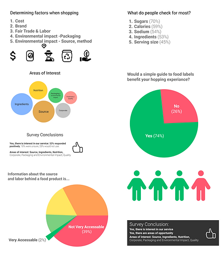
Survey Data
We gathered feedback from people who buy food supplies via a survey of 20 questions on google forms. This was dispersed online and we received 102 responses to our survey.
Initially, our goal was to encourage consumers to make more informed decisions on what foods to purchase. However, we found that users already were aware of the kinds of food they were searching for but were lacking readily available information for their needs. Based on the survey results and data, our goal shifted to be "How might we curate the shopping experience based on user goals, needs, and values?"
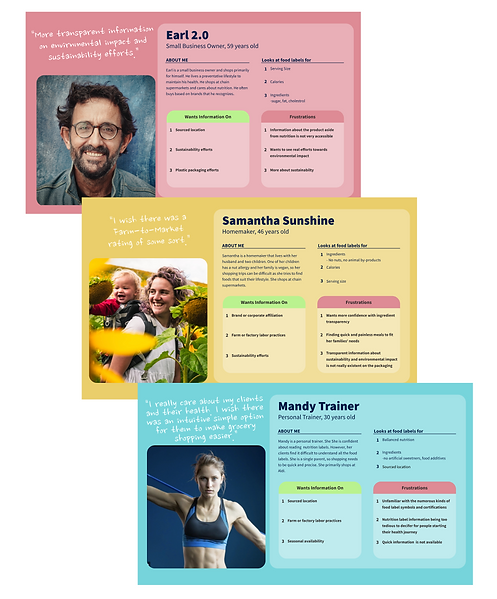
Personas
Based on the survey data and the comments we set up three personas. We referred to these personas throughout the development and they helped us conceptualize the user experience.
We used the user research to create each persona and included What they look for in food labels, what their frustrations are when they are food shopping, and what they want information on. This information helped us put our thoughts into perspective and think about the user needs and how to best create a product that meets these needs.

Sketches
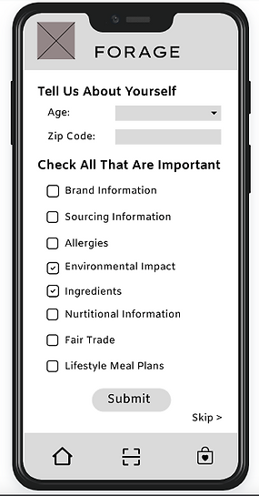
I started the design process with a low fidelity wireframe via sketching. I began with the landing page, the sign in page, and chose to start with a tutorial for first time users.
I tried many different sketches throughout this process and combined them to make the design as streamlined as possible. Using the user comments, my goal was to make the product as customizable as possible to curate the individual food needs of each user.
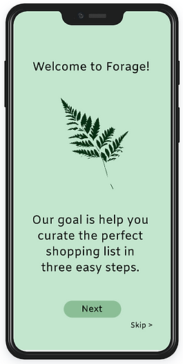
I chose to start the process with an introduction to the app and instructions on how to use Forage effectively. I decided to start this way because I wanted to prevent any errors, explain how much user control the user has, and show the flexibility of use. Based on the user feedback, I knew that it was essential to add information about allergies, give the choice of what is important to them, and lifestyle meal plans.
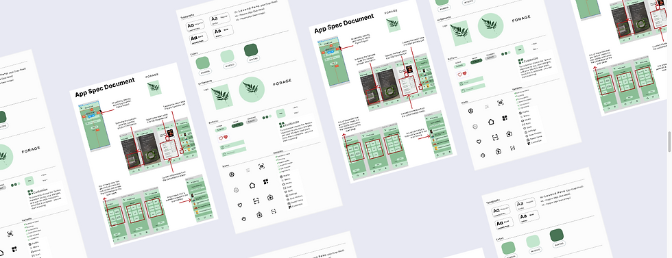
Wireframes
To create the wireframes I used Figma, Illustrator, and Photoshop. Initially, I designed the app to be in form based, with drop boxes and multiple choice answers for each section. However, this was up too cluttered and did not meet the aesthetic and minimalistic design that I wanted.
I ended up with three iteration and finally opted to use boxes to make the user experience as customizable as possible. The usability testing would provide vital feedback for my final design, which simplified the process without sacrificing the customizing features. The final design had more space and the overall experience was cleaner and intuitive.
User Testing
Before launching Forage, I conducted user testing to reveal the possible usability problems and areas of opportunities. The overall concept was well received however the initial design proved difficult for the users to follow and seemed overwhelming. With this in mind, I changed the design of the customizable options to be simple, clean, and easy to navigate. This changed the design from seeming less like a form to fill out and more of a seamless application.
The test subjects were two users within the target group (people that shopped for groceries for their household). The users were asked to complete the task of choosing a specific allergen, lifestyle meal plan, and important items as I recorded their screens. I found that as the new design was a lot more intuitive, the users enjoyed the flexibility and simplicity of the app.
UI Design
I designed my final version in Figma, using Illustrator and Photoshop for some touches. I used green to evoke feelings of freshness, security, and abundance. I took into account the user feedback and made simplicity and flexibility at the forefront of my design.
With this design, Forage can help achieve its goal of curating the shopping experience based on the user needs, goals, and values.
The design provides a simple platform to engage users via scanning products to see if they are in line with their previously chosen needs. Should their needs change, the app can be easily updated to match those needs.